Understand your place
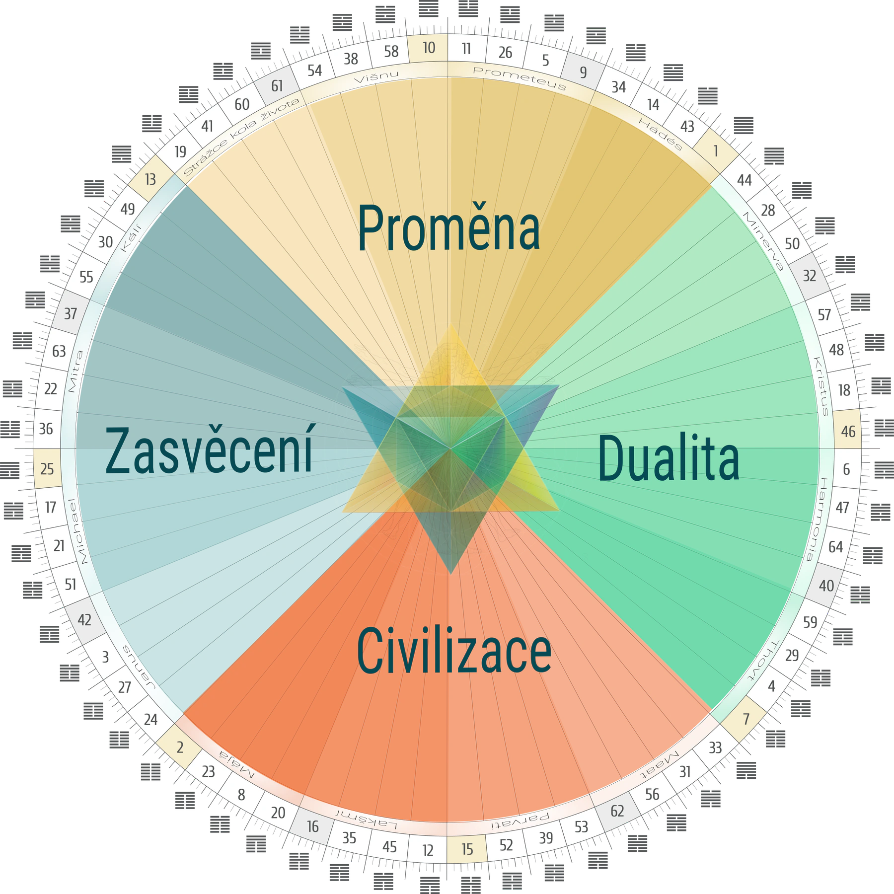
See which quarter of the mandala your archetype belongs to and what theme it carries in the totality of life.
:root {
–petrol: #073f4c;
–petrol-soft: #6f9da0;
–cream: #fbf6ea;
–paper: #f3e8d6;
–gold: #c99731;
–gold-dark: #9a6f1c;
–ink: #18363c;
–white: #fffdf8;
–line: rgba(7, 63, 76, .15);
–shadow: 0 18px 50px rgba(28, 57, 61, .13);
–sans: „Roboto“, Arial, Helvetica, sans-serif;
}
* { box-sizing: border-box; }
html { scroll-behavior: smooth; }
body {
margin: 0;
color: var(–ink);
background: var(–white);
font: 17px/1.72 var(–sans);
}
img { display: block; max-width: 100%; }
a { color: inherit; }
h1, h2, h3, h4, p { margin-top: 0; }
h1, h2 { font-family: Georgia, „Times New Roman“, serif; font-weight: 500; }
h3, h4 { font-family: var(–sans); font-weight: 500; }
h1 { margin-bottom: 18px; font-size: clamp(46px, 6.3vw, 86px); line-height: .98; letter-spacing: -.035em; color: var(–petrol); }
h2 { margin-bottom: 22px; font-size: clamp(34px, 4vw, 57px); line-height: 1.08; color: var(–petrol); }
h3 { margin-bottom: 10px; font-size: 27px; line-height: 1.2; color: var(–petrol); }
.wrap { width: min(1160px, calc(100% – 40px)); margin-inline: auto; }
.narrow { width: min(820px, calc(100% – 40px)); margin-inline: auto; }
.eyebrow { margin-bottom: 16px; color: var(–gold-dark); font-size: 13px; font-weight: 700; letter-spacing: .18em; text-transform: uppercase; }
.lead { font-size: clamp(20px, 2vw, 25px); line-height: 1.55; }
.small { font-size: 14px; }
.muted { color: #587076; }
.button {
display: inline-flex;
min-height: 52px;
align-items: center;
justify-content: center;
padding: 13px 28px;
border: 1px solid var(–gold);
border-radius: 2px;
color: white;
background: var(–petrol);
box-shadow: 0 8px 22px rgba(7, 63, 76, .16);
font-size: 15px;
font-weight: 700;
letter-spacing: .05em;
text-decoration: none;
text-transform: uppercase;
transition: transform .2s ease, background .2s ease;
}
.button:hover { background: #0b5261; transform: translateY(-2px); }
.button.secondary { color: var(–petrol); background: rgba(255,255,255,.6); box-shadow: none; }
.button.secondary:hover { background: white; }
.site-header {
position: absolute;
z-index: 10;
top: 0;
left: 0;
width: 100%;
padding: 24px 0;
}
.brand { display: flex; align-items: center; gap: 13px; color: var(–petrol); text-decoration: none; }
.brand img { width: min(310px, 48vw); height: auto; object-fit: contain; }
.hero {
position: relative;
min-height: 880px;
padding: 150px 0 92px;
overflow: hidden;
background: #f8edda url(„assets/hero-archetypy-v2.png“) center/cover no-repeat;
}
.hero::after {
position: absolute;
inset: 0;
content: „“;
pointer-events: none;
background: linear-gradient(90deg, rgba(255,252,244,.91) 0%, rgba(255,252,244,.70) 47%, rgba(255,252,244,.06) 75%);
}
.hero-grid { position: relative; z-index: 1; display: grid; grid-template-columns: 1.04fr .96fr; gap: 38px; align-items: center; }
.hero-copy { container-type: inline-size; }
.subtitle { max-width: none; margin-bottom: 24px; color: #36585e; font-family: var(–sans); font-size: clamp(21px, 2.2vw, 29px); font-weight: 400; line-height: 1.38; }
.date-line { margin: 0 0 22px; color: var(–petrol); font-weight: 700; }
.intro { max-width: 630px; margin-bottom: 30px; font-size: 18px; }
.hero-actions { display: flex; flex-wrap: wrap; gap: 12px; }
.mandala-wrap { position: relative; justify-self: end; width: min(100%, 610px); padding: 21px; }
.mandala-wrap::before {
position: absolute;
inset: 0;
border: 1px solid rgba(201,151,49,.42);
border-radius: 50%;
content: „“;
box-shadow: 0 0 0 15px rgba(255,255,255,.28), var(–shadow);
}
.mandala-wrap img { position: relative; width: 100%; aspect-ratio: 1; border-radius: 50%; object-fit: cover; box-shadow: 0 18px 60px rgba(7,63,76,.20); }
.fact-strip { position: relative; z-index: 2; margin-top: 72px; display: grid; grid-template-columns: repeat(3,1fr); background: rgba(255,253,248,.84); border: 1px solid rgba(201,151,49,.32); backdrop-filter: blur(8px); }
.fact { padding: 22px 25px; text-align: center; }
.fact + .fact { border-left: 1px solid var(–line); }
.fact strong { display: block; color: var(–petrol); font-family: var(–sans); font-size: 23px; font-weight: 500; }
.fact span { font-size: 13px; letter-spacing: .08em; text-transform: uppercase; }
section { padding: 100px 0; }
.question { text-align: center; background: var(–white); }
.question h2 { max-width: 860px; margin-inline: auto; font-family: Georgia, „Times New Roman“, serif; font-size: clamp(26px, 2.3vw, 34px); line-height: 1.18; font-weight: 500; }
.question .lead { max-width: 790px; margin-inline: auto; }
.divider { width: 72px; height: 1px; margin: 31px auto; background: var(–gold); }
.what { background: var(–cream); }
.section-intro { max-width: 800px; margin-bottom: 48px; }
.benefit-grid { display: grid; grid-template-columns: repeat(3,1fr); gap: 20px; }
.benefit {
padding: 30px;
border-top: 3px solid var(–gold);
background: rgba(255,255,255,.68);
box-shadow: 0 12px 36px rgba(7,63,76,.06);
}
.benefit-number { display: block; margin-bottom: 14px; color: var(–gold); font-family: var(–sans); font-size: 34px; }
.mandala-section { position: relative; overflow: hidden; background: var(–petrol); color: #eef5f1; }
.mandala-section h2, .mandala-section h3 { color: white; }
.mandala-section .eyebrow { color: #e6c472; }
.mandala-grid { display: grid; grid-template-columns: .92fr 1.08fr; gap: 60px; align-items: center; }
.mandala-card { padding: 18px; border: 1px solid rgba(230,196,114,.4); background: rgba(255,255,255,.05); }
.mandala-card img { width: 100%; background: white; }
.ticks { display: grid; gap: 16px; margin-top: 30px; }
.tick { display: grid; grid-template-columns: 28px 1fr; gap: 10px; }
.tick::before { content: „◆“; color: #e6c472; }
.program { background: #fffdf8; }
.schedule { margin-top: 42px; border-top: 1px solid var(–line); }
.lesson { display: grid; grid-template-columns: 76px 190px 1fr; gap: 24px; padding: 24px 10px; border-bottom: 1px solid var(–line); align-items: start; }
.lesson-no { color: var(–gold-dark); font-family: var(–sans); font-size: 32px; line-height: 1; }
.lesson-date { color: var(–petrol); font-weight: 700; }
.lesson-topic strong { color: var(–petrol); }
.bonus { background: rgba(201,151,49,.08); }
.why { background: var(–paper); }
.why-grid { display: grid; grid-template-columns: 1fr 1fr; gap: 60px; align-items: center; }
.quarters { background: transparent; }
.quarters img { width: 100%; mix-blend-mode: multiply; }
.why-list { display: grid; gap: 22px; }
.why-item { padding-left: 24px; border-left: 2px solid var(–gold); }
.for-whom { background: white; }
.audience-grid { display: grid; grid-template-columns: repeat(2,1fr); gap: 18px; }
.audience { padding: 26px; border: 1px solid var(–line); background: var(–white); }
.audience strong { display: block; margin-bottom: 8px; color: var(–petrol); font-family: var(–sans); font-size: 22px; font-weight: 500; }
.offer { background: var(–cream); }
.price-grid { display: grid; grid-template-columns: repeat(2,1fr); gap: 22px; margin-top: 44px; align-items: stretch; }
.price-card { position: relative; display: flex; flex-direction: column; padding: 32px; border: 1px solid var(–line); background: white; }
.price-card.featured { border-color: var(–gold); box-shadow: var(–shadow); }
.badge { position: absolute; top: 0; right: 0; padding: 7px 12px; color: white; background: var(–gold-dark); font-size: 11px; font-weight: 700; letter-spacing: .08em; text-transform: uppercase; }
.price { display: flex; flex-wrap: wrap; gap: 7px 12px; align-items: baseline; margin: 12px 0 18px; color: var(–petrol); font-family: var(–sans); font-size: 39px; line-height: 1; }
.price-eur { color: #36585e; font-size: .72em; font-weight: 400; }
.price-card ul { flex: 1; padding-left: 20px; }
.price-card .button { width: 100%; margin-top: 16px; }
.about { background: var(–petrol); color: #edf4ef; }
.about h2 { color: white; }
.about-grid { display: grid; grid-template-columns: .72fr 1.28fr; gap: 58px; align-items: center; }
.portrait { overflow: hidden; width: min(100%, 300px); height: 383px; border: 1px solid rgba(230,196,114,.5); border-radius: 52% 52% 10px 10px; box-shadow: 0 25px 60px rgba(0,0,0,.18); }
.portrait img { width: 100%; height: 100%; object-fit: cover; object-position: 50% 0; }
.about .button { color: var(–petrol); background: #f3d58a; }
.video { text-align: center; background: var(–white); }
.video-placeholder { max-width: 880px; min-height: 390px; margin: 38px auto 0; display: grid; place-items: center; padding: 40px; border: 1px dashed rgba(7,63,76,.35); background: linear-gradient(135deg, #f5ead7, #eef1e8); }
.play { display: grid; width: 74px; height: 74px; margin: 0 auto 18px; place-items: center; border: 1px solid var(–gold); border-radius: 50%; color: white; background: var(–petrol); font-size: 25px; }
.final-cta { padding: 90px 0; text-align: center; background: var(–paper); }
.final-cta p { max-width: 700px; margin: 0 auto 28px; }
footer { padding: 36px 0; color: #607478; background: #f9f6ef; text-align: center; font-size: 14px; }
@media (max-width: 960px) {
.hero { min-height: auto; padding-top: 130px; }
.hero-grid, .mandala-grid, .why-grid, .about-grid { grid-template-columns: 1fr; }
.hero::after { background: rgba(255,252,244,.72); }
.hero-copy { max-width: 760px; }
.mandala-wrap { justify-self: center; width: min(650px, 95%); }
.benefit-grid, .price-grid { grid-template-columns: 1fr; }
.price-card.featured { order: -1; }
.about-grid { max-width: 760px; }
.portrait { max-width: 300px; }
}
@container (min-width: 720px) {
.subtitle { white-space: nowrap; font-size: clamp(18px, 2.4cqw, 20px); }
}
@media (max-width: 680px) {
body { font-size: 16px; }
.wrap, .narrow { width: min(100% – 28px, 1160px); }
section { padding: 72px 0; }
.site-header { padding: 15px 0; }
.brand img { width: min(255px, 68vw); height: auto; }
.hero { padding: 112px 0 60px; background-position: 63% center; }
.hero::after { background: rgba(255,252,244,.78); }
.hero-grid { gap: 28px; }
.subtitle { font-size: 21px; }
.hero-actions { display: grid; }
.fact-strip { grid-template-columns: 1fr; margin-top: 44px; }
.fact + .fact { border-top: 1px solid var(–line); border-left: 0; }
.benefit-grid, .audience-grid { grid-template-columns: 1fr; }
.lesson { grid-template-columns: 44px 1fr; gap: 14px; }
.lesson-topic { grid-column: 2; }
.price-card { padding: 27px 23px; }
.video-placeholder { min-height: 300px; }
}
Online kurz · Human Design · životní poslání
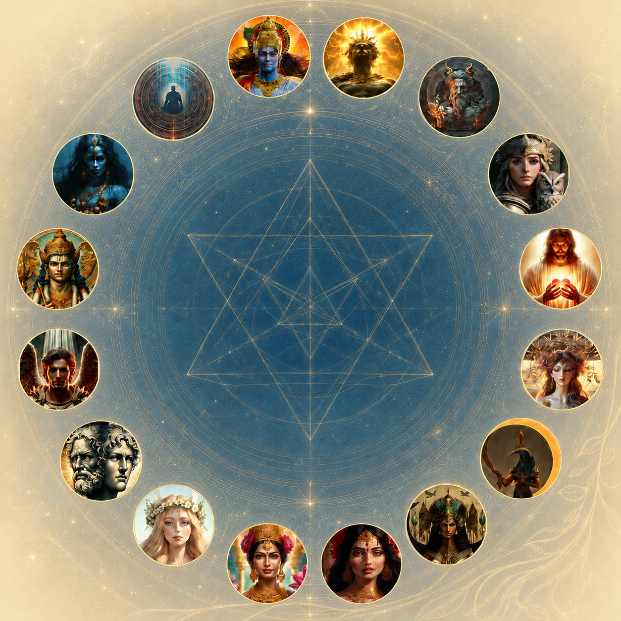
16 archetypů Human Design mandaly jako mapa hlubšího směru vašeho života
21 Oct 2026 – 13 Jan 2027 · každou středu · 18:00–20:15 (včetně 15 minut pauzy) · online
Poznejte hlubší příběh své Human Design mapy. Archetyp, do kterého vstoupilo vaše Slunce, ukazuje kvalitu, kterou přinášíte do světa — i cestu, po níž může vaše poslání přirozeně dozrávat. Ukazuje také na způsob, jakým jej naplňujete.
Možná to znáte
Human Design mapa neukazuje jen to, jak fungujete. Je v ní zapsaná i hlubší tematická krajina vašeho života: archetypální síly, které vás formují, zkoušejí a vedou k tomu, co máte předávat dál.
Co vám kurz otevře
Úvodní lekce se bude věnovat logice mandaly a archetypů. V každé další lekci se zaměříme na dva archetypy — kvalitu, historii i novou perspektivu.
See which quarter of the mandala your archetype belongs to and what theme it carries in the totality of life.
Connect the archetype’s symbolism with your own Sun, personal experience, and natural gifts.
Take away practical questions and reference points to recognize when you are truly living your purpose.
By exploring all 16 archetypes, you gain a broader perspective on the cycle and relationships across mandala themes.
Explore how archetypes operate in the old paradigm versus the new, relating to the global shift of 2027.
The final integration session brings the threads together into a personal map that continues beyond the course.
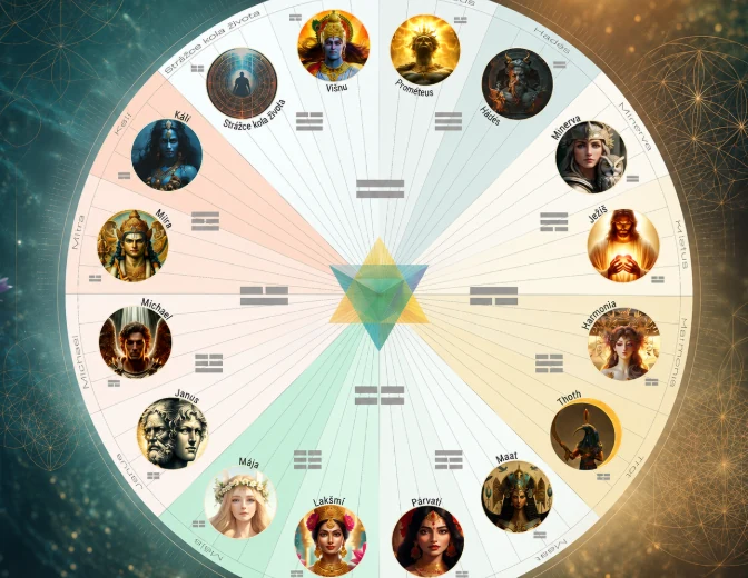
16 božských archetypů
Kálí, Mitra, Michael, Janus, Mája, Lakšmí, Párvatí, Ma’at, Thovt, Harmonie, Kristus, Minerva, Hádes, Prométheus, Višnu a Strážci kola života.
Program kurzu
V první lekci se budeme věnovat logice mandaly a posloupnosti archetypů. V dalších osmi lekcích budeme postupovat po dvojicích archetypů a závěr věnujeme integraci celého poznání.
Každé setkání probíhá od 18:00 do 20:15 (včetně 15 minut pauzy).
Proč právě tento kurz
We contextualize archetypes within quarters and gates so you understand their mechanics.
We connect the material back to your design, experience, and what seeks expression through you.
The sessions form a coherent arc — from initial orientation through sixteen archetypes to final integration.
Pro koho
Možnosti účasti
Vyberte si rozsah, který odpovídá tomu, do jaké hloubky chcete své archetypy a poslání prozkoumat. Objednávkový formulář se otevře s předvolenou variantou.
Early bird price until 14 Oct 2026 · Regular price 6,200 CZK / €255
For context on your Incarnation Cross
21. 10. 2026
Taster Option

Kurzem vás provede
Human Design propojuji s prožitkovými technikami, prací s energií a dlouholetou zkušeností s doprovázením lidí.
Human Designem se zabývám od roku 2013, jsem certifikovanou profesionálkou a učitelkou kurzů Žít svůj design, Rave ABC a Rave Kartografie. S mandalou pracuji aktivně a prožitkově od roku 2016. V kurzu vytvořím prostor, ve kterém můžete informace nejen pochopit, ale také vztáhnout k vlastní zkušenosti a nechat je postupně dosednout.
Videopozvánka
Pro video je na stránce připravené místo. Ideální obsah: proč kurz vznikl, co vás na archetypech fascinuje a co si účastník odnese.
Prostor pro budoucí videopozvánku
doporučená délka 60–120 sekund
Vaše cesta mandalou
Vyberte si variantu výše a dokončete objednávku v zabezpečeném formuláři FAPI. Máte-li otázku, napište mi.